●Visual identity — 2026
MB Wellness
Wellbeing isn't in a hurry. It's a path that grows, leaf by leaf.
01The challenge
MB Wellness, founded by nutritionist Marcella Bichara, was created to promote wellbeing and quality of life through personalized care — focused on weight loss, better habits and a more balanced life.
Her approach goes against quick fixes: the method is continuous, made of small changes that last over time. The challenge was to create an identity that conveyed this trust without feeling clinical or cold — a visual space of warmth, empathy and listening, consistent with the experience every patient finds in her office.
02The idea behind the brand
Care that grows naturally.
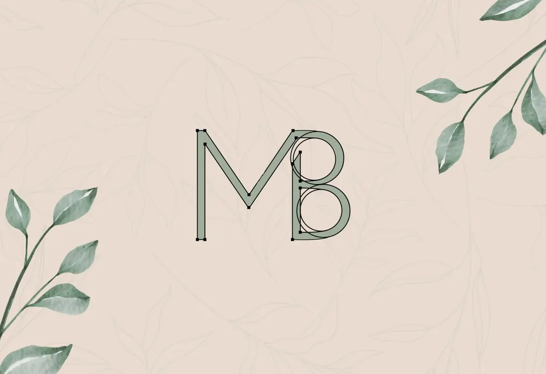
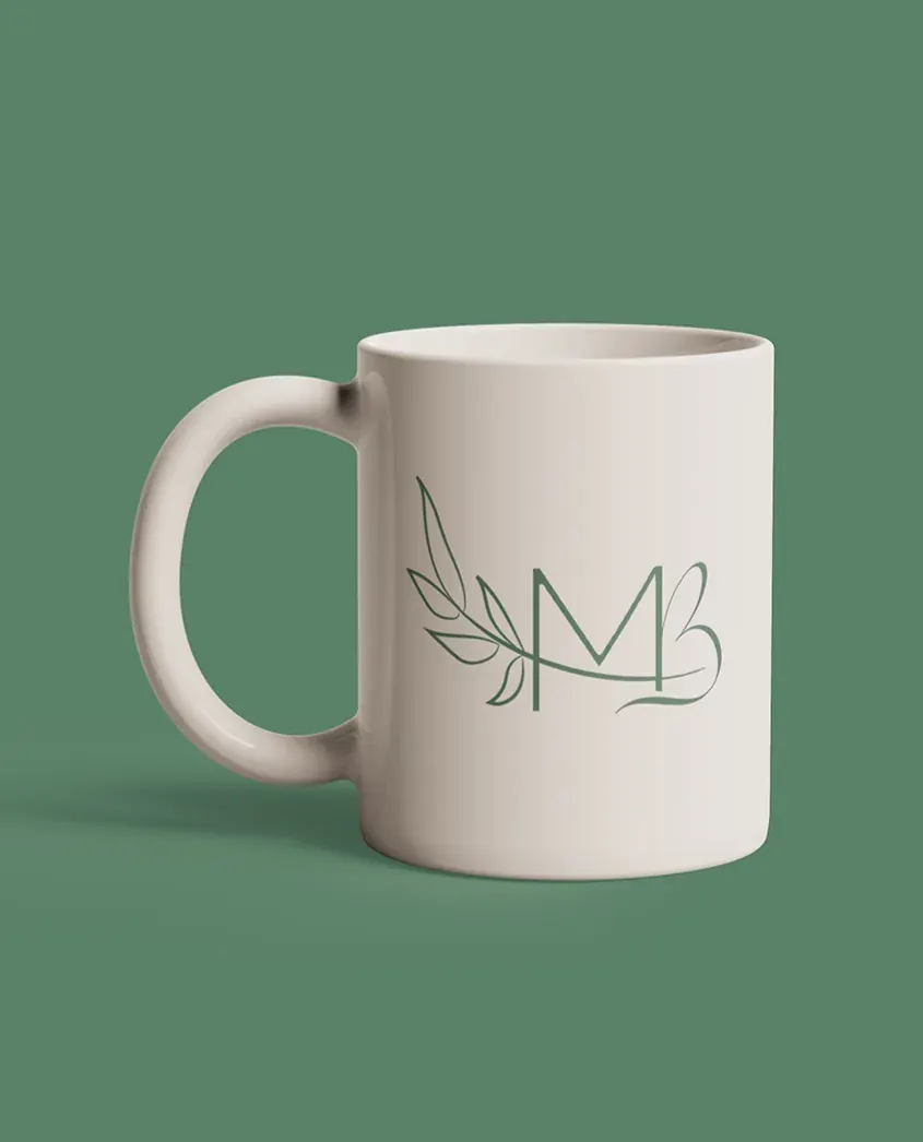
The monogram joins the initials M and B in a fine, continuous line built on precise geometry. A sprig of leaves grows from the drawing and wraps around the letters: a symbol of gradual growth, of change that happens little by little — exactly like the brand's method.
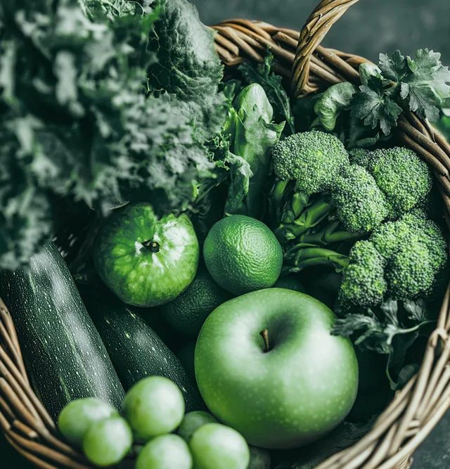
The palette pairs green, linked to nature, health and balance, with a warm sand tone that brings lightness and closeness. Clean, well-spaced uppercase type ensures clarity and professionalism, while leaves, fresh food and the body in motion complete a calm, human visual language.
03Personality and emotions
What the brand needs to make people feel.
- 01HumanThe brand talks to people, not goals: empathy and listening come before any plan.
- 02CalmOpen space, soft colors and fine lines keep away the anxiety of quick fixes.
- 03SensitiveDelicate details, like the sprig of leaves, show attention to every step of the journey.
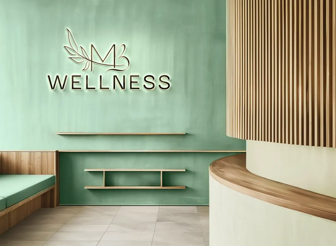
- 04WelcomingThe sand tone and natural language create a sense of trust, just like the office itself.
04Visual system
The elements that shape the identity.




Color palette
- GreenPrimary#5A826A
- SandSupporting#E9DBD0
Applications


Every brand has a story.
Yours can start now.
Like this creative direction? Let's talk about where your company is today and find out what your brand needs to take the next step.
Build my visual identity