●Visual identity — 2026
Essenza Fitwear
Strength and lightness in the same stroke. Feminine essence in motion.
01The challenge
Essenza was born from the desire to turn influence into purpose — a fitness fashion brand created from the feminine essence.
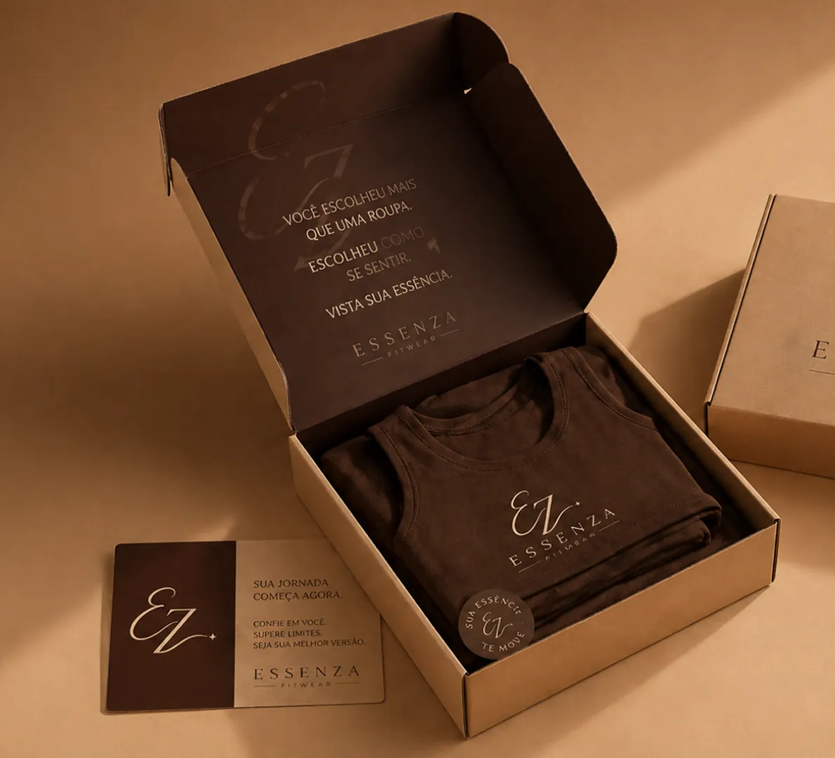
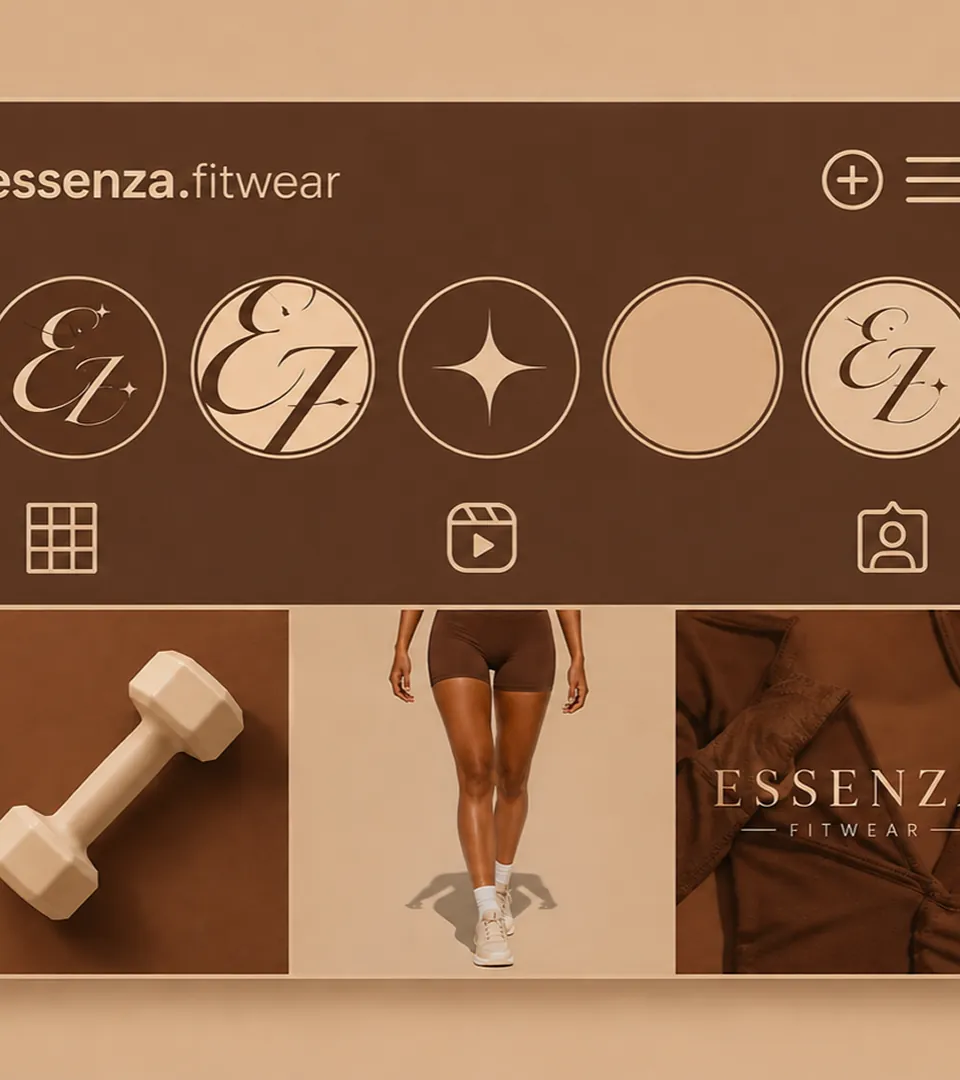
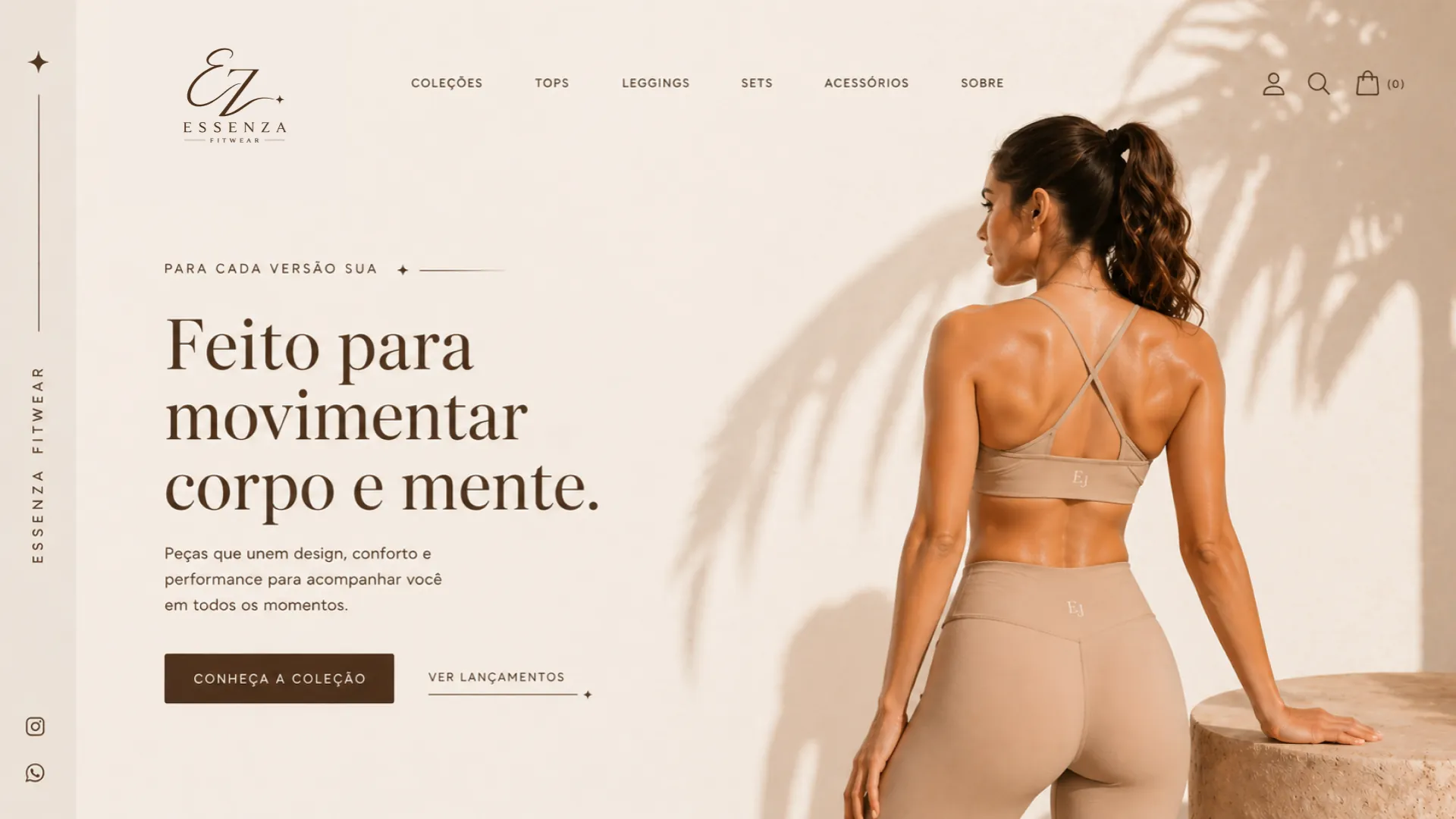
The challenge was to build an identity that conveyed authenticity, strength and a modern lifestyle: refined enough for everyday wear and consistent across garments, packaging, e-commerce and social media.
02The idea behind the brand
E and Z in a single movement.
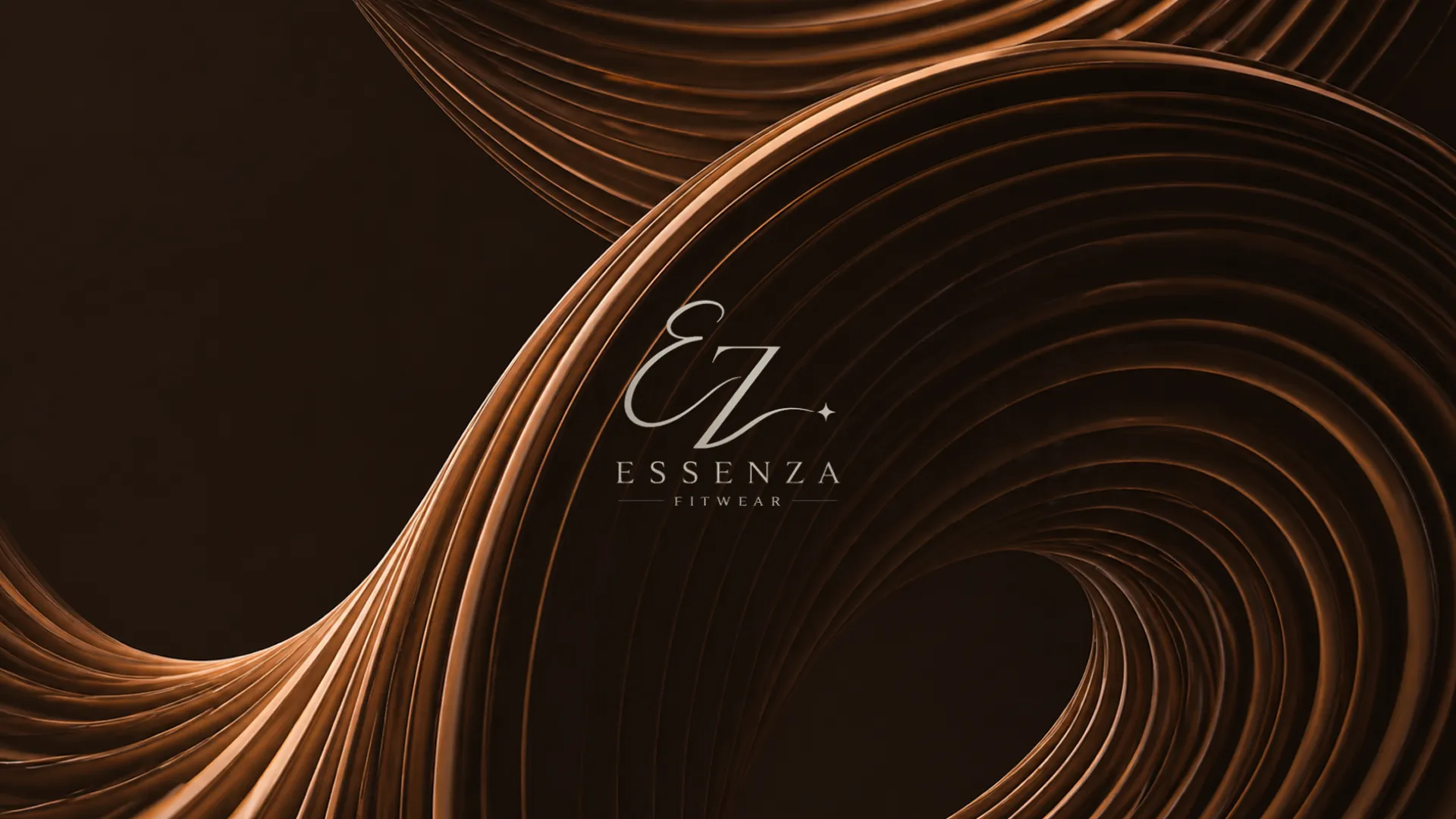
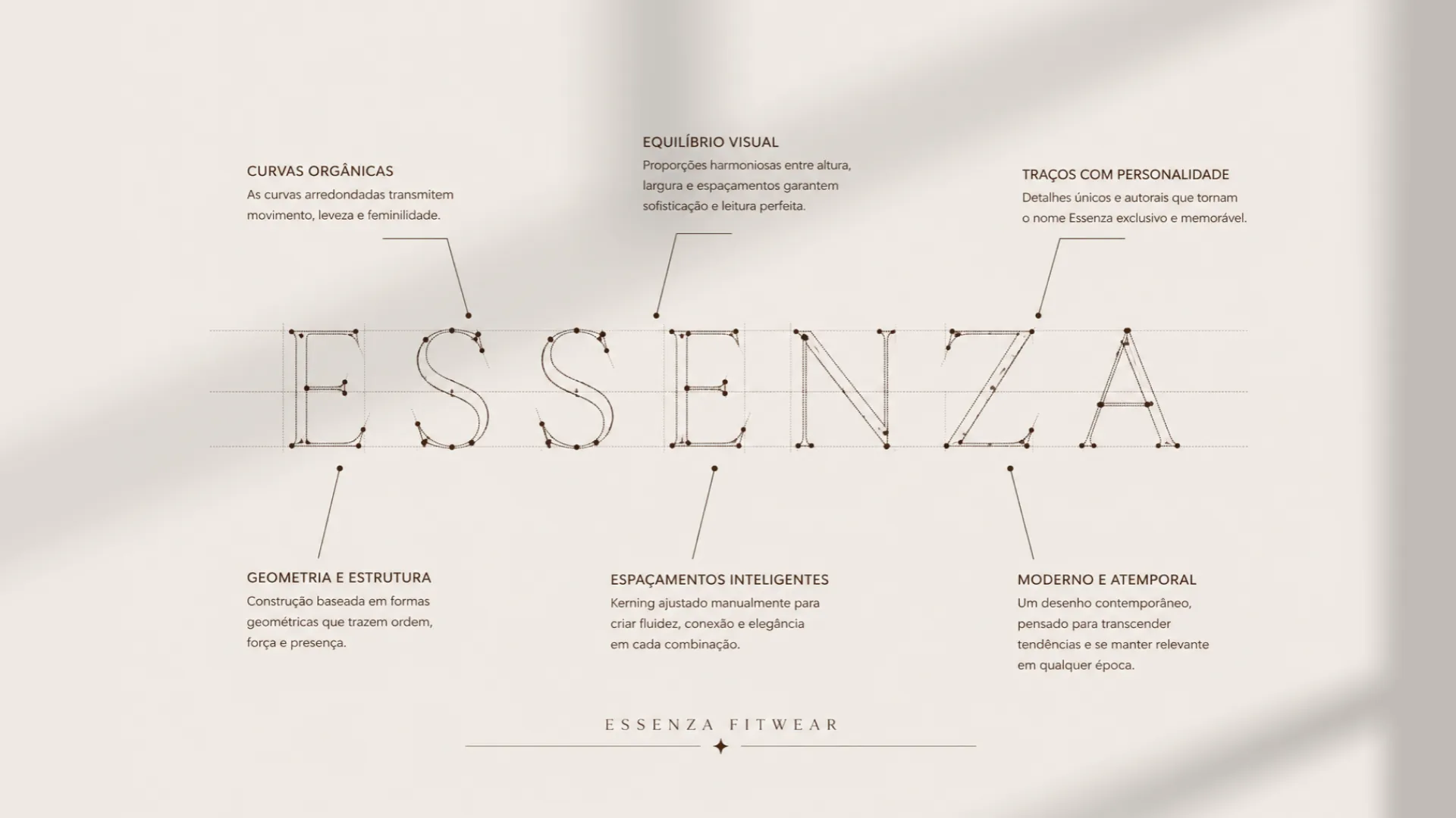
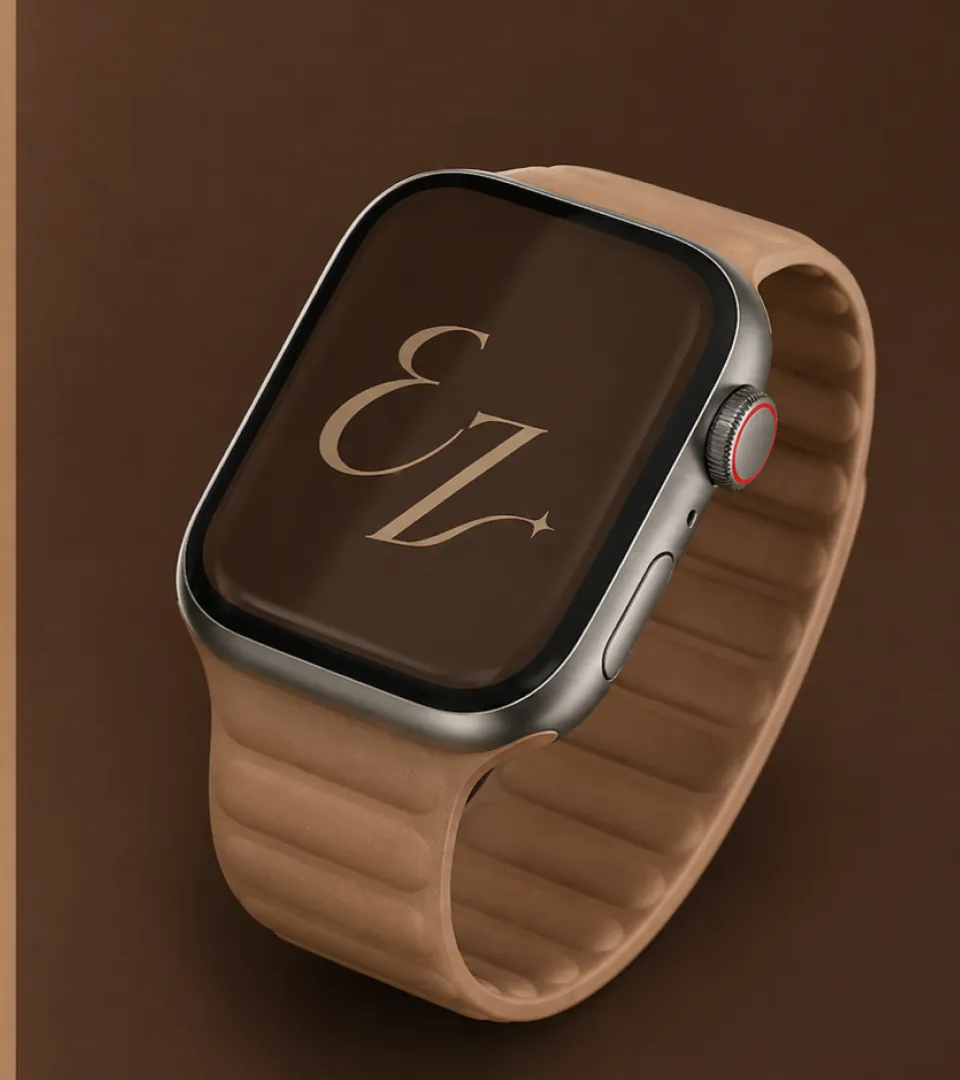
The symbol is born from typography: the letters E and Z join in a continuous stroke. Organic curves, inspired by the movement of the female body, bring lightness and flow; the Z adds direction, strength and a firm stance. A small sparkle completes the drawing — the touch of light that makes the brand unique.
In the logo, the base typeface received optical adjustments to weight, spacing and proportion for a clean, contemporary read. The palette follows the same logic: a deep brown as the base, sand as support and an off-white that lets the brand breathe.
03Personality and emotions
What the brand needs to make people feel.
- 01StrengthThe Z brings direction and a firm, decisive stance.
- 02FlowOrganic curves inspired by the movement of the female body.
- 03SophisticationEarthy tones and a sparkle for an elegant, timeless presence.
- 04AuthenticityA brand born from the feminine essence that turns influence into purpose.
04Visual system
The elements that shape the identity.


Color palette
- BrownColor 01 · Base#6A412E
- Off-whiteColor 02 · Breathing room#EEE8E1
- SandColor 03 · Supporting#D6BCA7
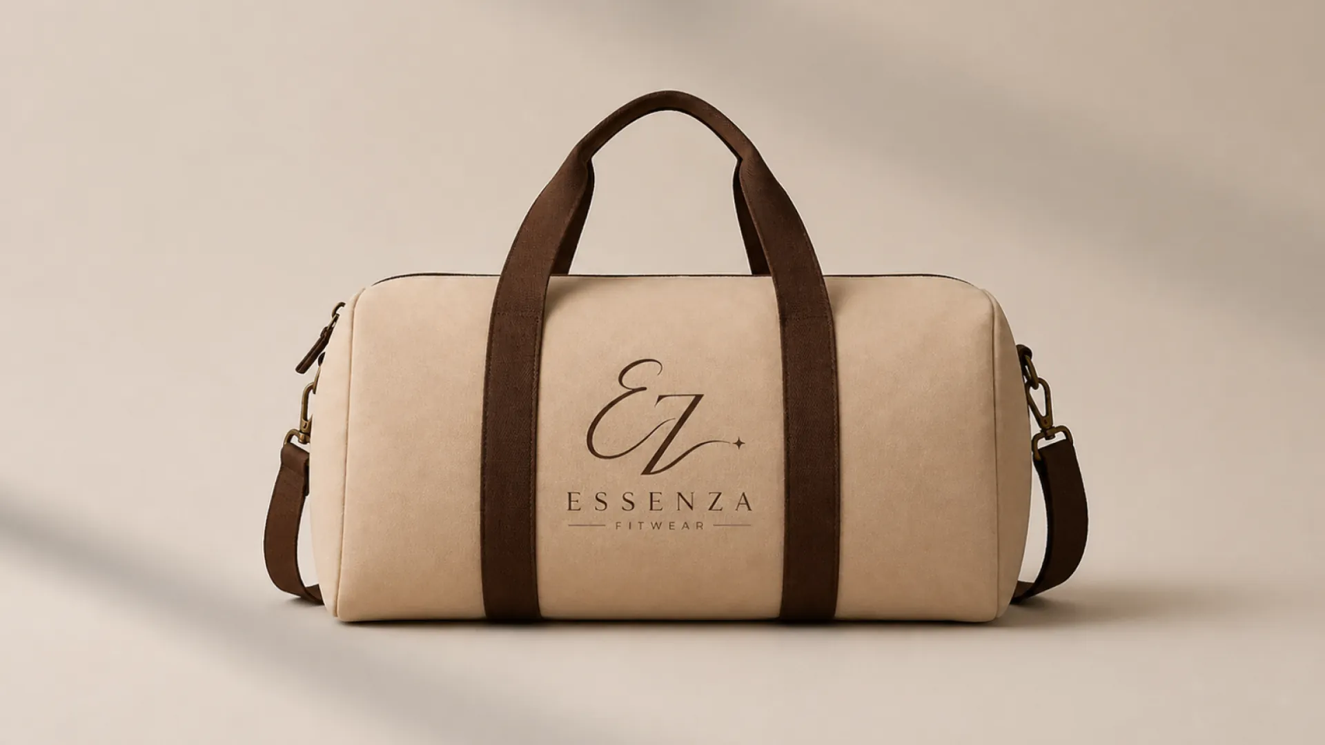
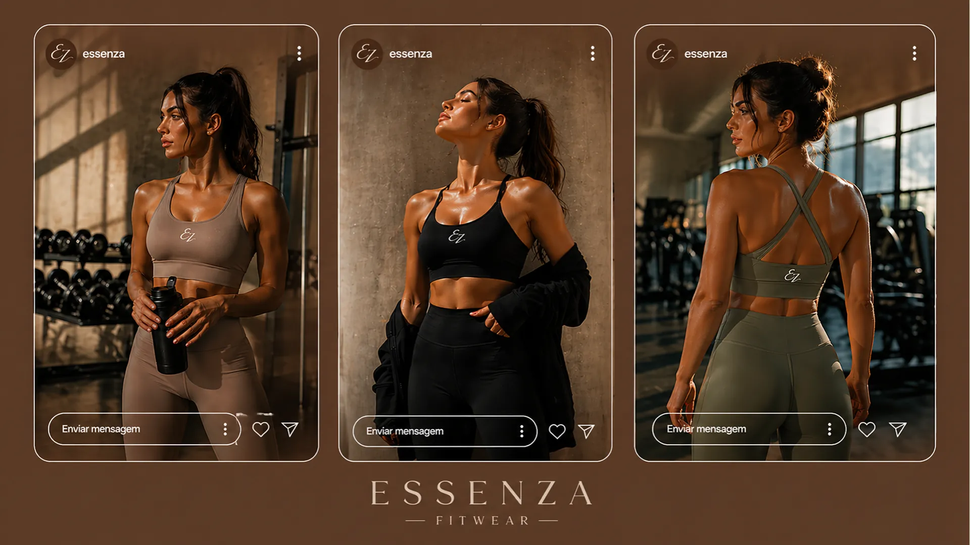
Applications



Every brand has a story.
Yours can start now.
Like this creative direction? Let's talk about where your company is today and find out what your brand needs to take the next step.
Build my visual identity